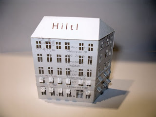
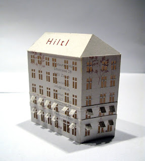
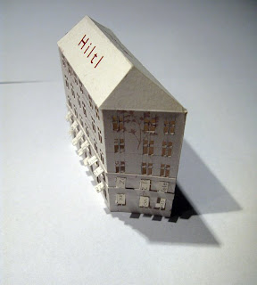
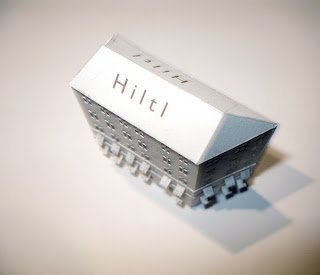
Hiltl Building. Zurich



By
skm
at
10:59 AM
567
comments
![]()
Labels: business card, collection:pr/ai, restaurants, Zurich


By
skm
at
9:56 AM
42
comments
![]()
Labels: collection: jmm/dk, NYC, wedding invitations
It has been an embarrassingly long time since I have put up any new TinyBuildings. Sorry. But, I have an excuse: I was busy making 85 TinyBuildings for gifts to guests at my daughter's wedding. They turned out great!
But, I have few excuses now, and will try hard to continue the collection this summer.
Thanks for all your kind comments on the earlier posts.
By
skm
at
9:27 AM
17
comments
![]()
Labels: excuses


Yet another of the oldest TinyBuildings: the "blue" post office. Poor, pitiful thing is mildewed and rather unlovely. It is also a 'bastardized' TinyBuilding in that it is made from two packaging materials.
The sides are from the cardboard cover of machine-dispensed stamps. The top is from one of the Atlanta blue-printing companies: AAA Blueprinting. Probably an extra business card included in a roll of prints delivered to James' office.
I can almost smell the developing fluid. This was way before the gigantic 'xerox' machines that are used now...or, for that matter, the direct-from-the Cad machine plots...That fluid was a sweet-acidic taste on the back of your tongue. Goodness knows what it was doing to our brains.
At the time, it signified progress on a project: if you had a roll of prints, you were finally ready to deliver them to a client. Finally, after many days and nights of thinking and drawing and erasing and drawing and thinking....
I like the little 'blue' roof section- a little hat for the building; and, you can tell James composed this TinyBuilding so that the old-fashioned mailbox fit on one side of the structure, exactly. Then he must have sorted through the detritus on his very messy drawing board to find the AAA card for the roof. I'll bet he smiled to himself when he stuck the 'blue' on top...a little cap, and a reference to the USPS colorings.
c. 1976
By
skm
at
9:07 AM
173
comments
![]()
Labels: building, collection: mkm/ce, original, packaging


This is another of James' vintage TinyBuildings. It must be over thirty years old. Looks pretty good, still...a little threadbare, but, so do you....
I think this tower is made from leftover architectural model-building board. The pink-ish color may have been meant to be brick or stucco. i don't know if James was testing a design for a client's house or just gluing scraps together. I also don't care; I just love this TinyBuilding for itself....that jaunty glued-on brown door is so assertive, I laugh out loud!
I wonder what the roof paper came from. Maybe its an insert paper from a candy box- like Godiva...those wax-coated sheets they lay on top of the candies to protect them from the box top. Hmmmm? something like that...a flicker of memory is trying to come forward...Hmmm?
c. 1976
By
skm
at
8:47 AM
0
comments
![]()
Labels: building, collection: mkm/ce, miscellaneous cardstock, original


This is a second version of Hearth. The earlier one was much more simplistic; and this one catches the essence of the restaurant more richly than the 'beginner' version [I think it's the chimney that does it...]. I'm particularly proud of the way the flame image from the card continue across the roof and canopy. Oh, Joy!
Hearth is on the north western? edge of the East village [not sure exactly where the village starts and stops]. The wine list is excellent and the food is great. Rustic, but refined, if you know what I mean. This place means 'comfort food' to us, so we've trudged there in ankle-deep snow, on bitterly cold nights, for some good hospitality and warming food.
c. 2005
By
skm
at
9:25 AM
45
comments
![]()
Labels: collection: jmm/dk, NYC, restaurants


The third 'chapel' happens to be an attempt to replicate the actual building, in a vineyard, where the reception was held. It is a beautiful old stone farm building, with a loft space for parties and weddings and such.
This invitation was handmade by the couple, with loads of patience, creativity, and joy, it seems. They used small strips of colorful illustrations from magazines and other sources to create obi-wrapped bundles of paper. The colors they selected evoked the Tuscany-like place they had their ceremony; and were a great contrast with the naive austerity of the printed invitation.
Great imagination to meet a tight budget, and perfect materials for a tinybuilding.
c. 2007
By
skm
at
5:06 PM
111
comments
![]()
Labels: collection: dm/jk, Maryland, wedding invitations


This is one of the *gift* chapels for family friends. This invitation is so beautiful-with yummy colors, patterns and textures. I wanted to use the embossed portion as the roof, so the main building turned out sorta large. I added the tiny, tiny outrigger building to soften the scale of the larger 'airplane hanger'; and to add a little tension into the equation.
Nice, huh?!
c. 2006
By
skm
at
4:50 PM
1 comments
![]()
Labels: collection: jd/ig, san francisco, wedding invitations


This year, a new sub-tradition of the Christmas tinybuildings came into being. My son and his wife asked me to make tinychapels from the wedding invitations of a couple of their friends-as surprise gifts.
They turned out so nice, and it was such a good idea that I backtracked and made them a wedding 'complex' from their invitation. [I should have thought of this myself, right after their 2005 wedding.]
This 'complex' of tinybuildings came about because I wanted to include all the salient facts about their wedding day- the names, date, location- and to attempt to capture the warm feelings and aesthetic tone of the day.
I think the beautiful blue bird on the invitation inspired a tinybuildings 'first'- the arched roofs. Aren't they beautiful?!!!
A nice result from the multiple-buildings format is that they occasionally rearrange the buildings in their place on a living room bookshelf. I hope when they are doing that, it causes them to re-imagine that happy and beautiful day in their lives...
By
skm
at
9:48 AM
3
comments
![]()
Labels: collection: mkm/ce, san francisco, wedding invitations


A-H-H-H-H! Bluehill at Stone Barns!!!! I cannot recommend this place heartily enough. It is just above New York City, along the Hudson River, just outside Tarrytown. Totally worth the drive out of the city. Some years back, Dan Barber, the chef at Bluehill Restaurant in the city cut a deal with David Rockefeller to turn his family estate into a working organic farm with a restaurant and educational center. and it is worth every penny of the tens of millions of dollars they spent in making it operable and beautiful. Its worth the trip just for the stonework, let alone the beautiful wood beams and wonderful lighting.
Then, there is the food. OMG!!!!! Elegant, imaginative, fresh, beautiful food! and a great wine list....
If you have been paying attention, you will remember this card was used to make the Virginia cabin, some posts back. I admitted in that posting, I believe, that I had borrowed the cardstock because it looked like stacked logs. Well, now you can see the *real* restaurants representation. I may have to make another one or two...I want to make the grouping of buildings around a stone courtyard which you walk through on the way from the valet parking point to the restaurant...you get a peek into several other structures...must go up there for one of the tours or classes....
c. 2004
By
skm
at
5:06 PM
1 comments
![]()
Labels: collection: jmm/dk, NYC, restaurants


Blowfish is [I guess it still "is"- I haven't been there in years...] a brash, 'happenin'' sushi place in San Francisco. Its decor is intended to be as*dangerous* as its name implies. I vaguely remember it as dark, with hot spots of lights, noisy maybe...but the noise may have been all visual...
The sushi was yummy. I don't know why we haven't gone back. Could be because there are always newer places to try in that oh-so-receptive city.
The shape of this tinybuilding is also trying to be *dangerous* and noisy. Sort of mysterious and dark inside-and-out. Maybe a sushi speakeasy.....I think this was the first unusual roofline i attempted. Somehow, a hip roof with gables just wasn't gonna say *dangerous*. This tinybuilding is about 1-1/2 inches tall.
c. 2002
By
skm
at
4:51 PM
2
comments
![]()
Labels: collection: mkm/ce, restaurants, san francisco


Star Provisions is the sister to Bacchanalia. They share space in the same old factory-type building in a newly 'up-and-coming' area of Atlanta.
This is an example of a tinybuilding where, to make the style of building I was after, I used a foreign material in addition to the shop's business card. The roof is made from a corrugated cardboard heat-sleeve from Starbuck's.
It happens that I made this tinybuilding after a trip to the Gulf Coast and a tour of one of the new developments- Rosemary Beach. The architectural style of the buildings there is sort of Norman French, with a smidge of Spanish influence.....a little bit of everything to please everyone. Somehow, when I sat down to make this house, the card colors and the star motif reminded me of Rosemary Beach. Can't say exactly why...
So, I just *needed* a Spanish tile roof. Hence the corrugated cardboard... And, of course, with the gridded design of the card, I just *had* to center a window in each square....*had to*...
I like this tinybuilding, It is charming, just like its namesake. It is about 1-1/2 inches square.
c. 2001
By
skm
at
7:04 PM
8
comments
![]()


If I remember correctly, this is one of my early tinybuildings. At least, I hope so, because it is rather boring. It does have some degree of dignity about it- mainly due to the design of the business card- but, it's a little too elemental.....
Bacchanalia is a very respected and successful 'upper class' restaurant now located in Atlanta's West Village area. Originally, it was about a block from our family home in Buckhead. James and I used to go there for very special celebrations. As it became so successful, they relocated to have more room, and to upgrade the environs. My kids and I have been to the new site a couple times.
More recently, the owners/chef have opened several other restaurants around Atlanta; and a specialty food shop adjacent to Bacchanalia. The shop- Star Provisions- is the source of the next tinybuilding.
c. 2000
By
skm
at
6:50 PM
23
comments
![]()
Labels: atlanta, collection: mkm/ce, restaurants


Hmmmmm. This was one of my earliest tinybuildings; and the cardstock, being coated, was very hard to work with. At least those are the excuses I'm using for such crude workmanship. But, it has some redeeming qualities: it's shiny, looks a little bit like the *real* restaurant, has some cute awnings, and the 'patisserie CAFE'' is nicely composed. Citizen Cake is about 1-1/2 inches tall. [and needs some repair...must go visit it.]
We haven't been to this restaurant in a long time. Don't know why exactly- probably because there are so many newer, better choices now. Food was good, maybe not great. Space was nice.
c. 2000
By
skm
at
8:19 AM
10
comments
![]()
Labels: business card, collection: mkm/ce, restaurants, san francisco