22 May 2007

International Orange Spa. San Francisco


Since the IO Spa is an interior space in a nondescript building, I made an 'interpretive', spa-like tinybuilding, using the graphics of the card to shape the structure. This is a case where the card definitely does the space justice. Just looking at it makes me more relaxed....

The interior of the spa is similar to the tinybuilding: white curving walls and slotted display areas and windows.

I especially had fun 'twisting' the logotype around the structure. I think it is rather Zen-like, whatever that means....

I did use multiple cards here, because I wanted the IO flag on top, leading you to a wonderful, relaxing and rejuvenating spa experience.

c. 2006

14 May 2007

Delfina. San Francisco


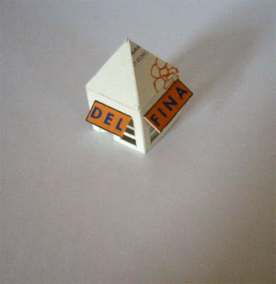
Let me tell you about the most wonderful 'food street' in San Francisco...maybe even in the U.S. - Eighteenth Street, between Guerrero and Dolores, in the Mission district...This is foodie heaven. On the corner is Tartine Bakery. Next to it it Delfina Pizzeria, an annex to Delfina. and next to that is Bi-Rite Market, a small, family-owned market with everything you could want to prepare a wonderful meal. A little farther up the street, and across, is Bi-Rite Creamery...unimaginably good ice cream in very imaginative flavors.

So, walking less than a block, you can have brunch, a very special pizza, shop for dinner or make a reservation at Delfina, then hop just the block for an ice cream cone to carry around the block as you try to walk off the pounds. You will have had some of the best meals ever! No exaggeration.

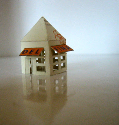
This particular tinybuilding is my granddaughter's. She had dinner there when she was about two weeks old. She was very well behaved and charmed all the staff and customers. Her parents also have a Delfina in their collection because it is a very special place to them. They got engaged there, had their rehearsal dinner there, and have celebrated many other times of there lives together there.

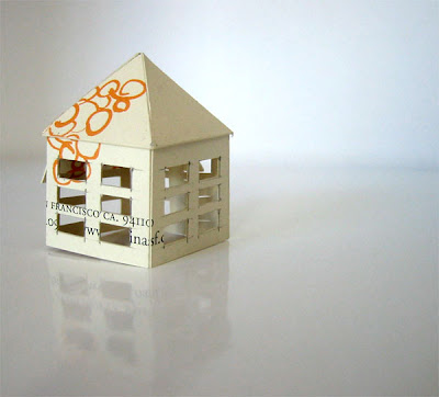
Delfina is about 3/4 inch square. The shape is somehow reminiscent of Tuscan farm outbuildings I saw there some years back. The *real* Delfina Restaurant was originally inspired by a small well-respected restaurant of the same name somewhere in Tuscany. We tried to eat there on our travels, but it was vacation season and the owners and chef had fled to wherever Italians go when they just can't stand one more American.

If you find yourself in San Francisco, go to Delfina and order the tomato-sauced pasta. So simple and so delicious.

c. 2007

12 May 2007

Universal Cafe. San Francisco


This is the most recent tinybuilding in my granddaughter's collection. She has, at 4 months, already dined there at least twice.

This is one of the rare situations where the graphics of the restaurant's business card do not do the restaurant justice. The design, service and food and wine at Universal Cafe are much more sophisticated than this ugly card. I mean, why the red and blue; and why that nasty distorted star?

So, I had a rather hard time convincing myself to make a structure from it. If the restaurant didn't have such a presence in the SFO family's lives, I would never have bothered. My response was to make a little visual joke: the shape of the tinybuilding is reminiscent of a church - the Universal church. hahaha.

But here it is. The Universal 'church' is about 1-1/2 inch tall.

c. 2007

10 May 2007

Toblerone Ski Lodge. Switzerland


Speaking of Switzerland, this rather crass construction is one-of-many made for Jane's 'Shortest-Day-of -the-Year Party a couple years ago. The party theme was 'Swiss', with raclette as the main course. Jane asked me to make party favors for the guests - a challenge to make a dozen quickly.

Christina asked her Mom to send Swiss packaging so I could have authentic materials to work with. However, I was forced to buy a couple of Toblerone chocolate bars, just to be sure I had enough cardstock. You know how it is - anything for your kids...

I'm planning to re-collect and photograph the favors...perhaps we can have a 'Longest-Day-of-the-Year' Party this summer, and have a reunion of people, food and tinybuildings. I'm ready...how about you, Jane?

This tinybuilding is one of the larger ones: about 1-1/2 inch cube. I researched online to find photos of swiss ski cabins/cottages, then copied their design, including the balconies, roof pitch, overhangs, window spacing....Got to be as accurate as possible at 1-1/2 inch and working with cardboard....

c. 2005

Hiltl Cottages. Zurich


These tiny cottages, with steep roofs to shed the snow in ski season, are made from business cards of a great vegetarian restaurant, an institution, in Zurich. Jane and I ate there with Christina Ruegg's brother and his now-wife, a couple years ago. I wish there were such a place in Atlanta or even NYC or SFO.

Like the Toblerone tinybuilding, they were made for Jane's SDOTY Party.

The tinybuildings are *tiny* - about 1/2 inch square, and 3/4 inch tall. Because they're so small, I made two of them so they could protect each other....

As a 'thank you' for introducing us to this wonderful food place, I made
Christina's brother a replica of the Hiltl building. It is the most complex tinybuilding I've ever made. I'm hoping to get photos of it from him, because the ones I had were lost in an earlier computer meltdown.

c. 2005

08 May 2007

Materials sources.

Most of the tinybuildings are made from business cards, usually from restaurants, but sometimes stores or museums or even companies. Some of them are made from packaging, usually food.

Whenever I am in a place that I have enjoyed visiting and want to recall later -particularly if I'm there with my kids- I collect a small stack of cards from the cash register/reception/maitre d' desk - especially if the design of the space and the graphics of the cards are memorable. It is a little game to get away with not one, not two, but, maybe six-to-eight cards.

It is very satisfying to know that I have the cards stored away in boxes in my work area, even if it might be years before I use them to make a tinybuilding. I can open one of the boxes [there are drawers full!] spread out a stack of the cards, and let my memory wander through good meals, good times, nicely designed spaces.

Then, one day, one of the stacks will 'call my name'; and I will think about some special menu item or some great toy purchased, or there is someone I think will really like a tinybuilding memory, and a new tinybuilding is underway.

The food packaging is much harder to work with than the business cards. It is usually a light weight cardboard and is softer and less rigid. I can't get the crisp corners and clean cuts like I can with business card cardstock. That's why the form of the roof on the Carr's Cracker box is rather messy; and the windows are larger - it is almost impossible to make the really little casement windows in cardboard. But, sometimes, I just have to use it because I am eating some caponata on a Carr's Cracker and I remember a sunny afternoon with wine and snacks from 20 years ago...Got to memorialize that!

Carr's Crackers.2. Packaging


The second Carr's Cracker tinybuilding- smaller, but still using the Nutrition panel to size the windows. This roof was hard to build, hence the less-than-professional craftsmanship...sigh...But, you've still got to love this little thing...makes you happy, doesn't it?! See what I meant about it reminding me of a Caribbean cottage/hut. Definitely a beach structure.

Carr's Crackers.1. Packaging


This is one of two versions of tinybuildings made with a Carr's Water Cracker box. It is a slightly larger-than-normal structure - about1 inch x 2 inch x 2-1/2 inch tall. Also, it is a larger 'scale' than most: the windows and door are large- driven by the bold lines of the Nutrition Facts panel. I just *had to* make the windows that tall. And the Queen gets her due by being prominently acknowledged on the roof.

07 May 2007

Tinybuildings. 'elements of style'

When I first started making these tinybuildings, being the anal-retentive designer that I am, I instituted some 'design guidelines' for myself. The guidelines are based upon a sense that the proportions of the business cards or the graphics on the packaging or some ethereal 'perfection' drive the size and shape of the completed tinybuilding. They are not arbitrary sizes and shapes, but inevitable little icons.

It might be that the text on the front of a restaurant's business card reminds me of a sign, like on the Bi-rite Creamery; then, I look at the remainder of the card to see how I might replicate the same proportions of the actual building with the logo ending up at the top/center of the structure.

Whenever possible, I use just one card per building. In some cases that just isn't possible - either because the finished structure wants to be bigger [like the Tartine] or because the actual configuration and proportions of the original building just cannot be replicated with one card.

Packaging gives me more options, but I still try to use just one corner of a box, or one side; although like in the case of the Carr's Cracker house, I deliberately used the illustration of a single cracker to make the roof. Funnily, this roof shape makes me think of a cabana on some Caribbean island - I can see it made from palm fronds....

I *must* say, I just love the SKU lines and the Nutrition listings on packaging. They are so dynamic and so remind me of architectural finishes like siding or stone. Wonderful graphics!

I search the text and graphics and color-fields on original cards and packaging to decide where to place windows and openings - cutting along imagined lines at intervals determined by the graphic designer's sense of proportion determines if the windows should be casement with mullions or vertical slits or French doors, or *picture windows*. I have noticed that I generally default to more 'romantic' architectural styles if I am not making a *real* building, but rather creating an appropriate impression or style.

There are exceptions to this though. For instance, the 'Glass' building; and the 'Blowfish' building just *had* to be Modern. Their cards graphics were just too bold and high-contrast to become quaint cottages or shops. In fact, the 'Glass' modern house is made from a hangtag from a bottle of Monetto Prosecco: so there is a tiny/little joke here about living in glass houses. And, the 'Blowfish' building is made from the business card from a *wild* sushi restaurant in San Francisco. The night we ate there, we sat at the sushi bar; and the overall impression I left with was one of 'disco sushi'. I vaguely remember bright flashing lights, reflections in mirrors, colored-glass pendant fixtures, stained concrete floors, etc. The actual space may be nothing like this - but that's what I envisioned when I sat down with the 'Blowfish' card and began to cut and shape the final tinybuilding.

One rule is to try to make the structures out of continuous strips of cardstock. Following this rule tends to result in the smallest buildings- there are only so many inches in a business card. So, instead of cutting and joining at each corner, I try to start at what is going to be one corner of the final tinybuilding, then kerf the cardstock to fold it at subsequent corners; eventually joining the ends at the fourth corner. I have to constantly remind myself to allow for the taller, triangular shape of the gables, so I don't have to patch a piece onto the ends. I *hate* having to do that, and usually destroy those attempts.

There are other rules and guidelines, but they are all subject to being overridden by some *flash* of inspiration. When I hold a card or a flattened package in my hand, ready to start cutting, I can *feel* just what I'm supposed to do first, and second, and third....

As I sit down to make a tinybuilding, I feel a delicious sense of opportunity and inevitability. There are so many possibilities, but just one *perfect* tinybuilding waiting in the colors and letters and proportions of the card or packaging. The challenge is to cut and fold and paste and form the flat cardstock into a three-dimensional replica of four-dimensional memory - of an occurrence, an event, a good time and place and people.

06 May 2007

A Village Christmas Tree. An original edition


A somewhat bedraggled Christmas tree, possibly one of the earliest editions of tinybuildings- way back in 1975 or so. It may be from the holidays when Jane, four years old, managed to get one of the stars in her eyes...It took a trip to an opthamologist to get it removed. Not fun!

It looks like James made this from a metallic paper-coated cardboard box, with added 'sequins'. It is about two inches tall. We placed it in the Town Square of the tiny village of tinybuildings. We supplemented the handmade structures with wooden matchbox sheep and fences and little men with bowlers.

c. 1975

de Young Museum. San Francisco


The de Young Museum, in Golden Gate Park, is a nice surprise amongst the slightly musty traditional buildings and shady walkways. This is my attempt to interpret the structure of the building-recalling the peek-a-boo quality of the facade and the airplane wing effect of the roof. Of course, the tinybuilding is made from one of the nicely designed, over-sized business cards from the Museum. The tinybuilding is about 1-1/2 inches square.

c. 2006

05 May 2007

Log Cabin. Virginia


This is one of my very favorite tinybuildings. It is a replica of log cabin, in the woods near Falls Church, Virginia. The business card is from Blue Hill @ Stone Barn, a really special restaurant and organic farm in the Hudson Valley, north of Manhattan.

I have made several copies of the cabin, as gifts for various families with connection to it; hence the multiple 'collections' label.

I prefer for the buildings to represent whatever the business card is from, but the stripes on the back of the restaurant's card so perfectly mimicked the horizontal lines of the log cabin, I just couldn't resist.

The tinybuilding is 'to scale' with the original cabin, which is in an idyllic locale, resting in a small clearing in some woods- visibly removed from the neighborhood that surrounds it, but within an easy hike through the woods.

c. 2005

Pasta Package. An original edition


This is one of James' original tinybuildings. I am not sure what kind of package it was, but from the words and images visible, it seems to be pasta-related...True to his personality, James' tinybuildings are more casual and interpretive than mine. He was an architect, and his unbounded creativity shows in these tiny 'bus man's holiday' efforts.

Unfortunately, the dates of the original tinybuildings can be only a guess- we were not very careful with them, and few remain. Generally, they were made between 1975 and 1990.

c.1980

Pizzetta 123. San Francisco


A tiny pizza 'parlor' that is not much bigger than the tinybuilding version.

This is an 'interpretive' structure- the original restaurant is on the street level of a 3-4 story building. The graphics of the business card, with the large, bold numbers, inspired the shape of the structure -'super' graphics redeux.

c. 2005

KidO. NYC


These three connected tiny buildings are the first in my new grand daughter's collection. There is a mommy house, a daddy house, and a baby bear house. The daddy house is about one inch high.

They are made of cards from a great kids' store in the West Village. I am sure many presents will be purchased here.

c. 2006

Tartine Bakery. San Francisco


The BEST bakery on earth! [even Mark Bittman agrees.] And the morning bun- a cinnamon roll for the gods- is the best-of-the-best. It is impossible to fore go them if you are in the Mission neighborhood. The lines are long and the service is sporadic, but it's all worthwhile.

This is one of the tiny buildings that is an attempt to replicate the actual structure. Go see for yourself. It is also one of the larger buildings. It is about 3-1/2 inches by 2-1/2 inches by 2-1/2 inches high.

c. 2004

04 May 2007

Hearth. NYC


One of the really nice restaurants in the East Village, it has been the site of some great meals...they have an impressive wine list and great service. We have had several family celebrations there.

The pencil marks are 'proof' this is handmade....and they add to the character....

c. 2005

Bi-Rite Creamery. San Francisco


This is the yummiest ice cream store on earth. It opened in the Spring of 2007, in the Mission District. It is just up the street from Bi-Rite Market and Tartine's, and Delfina's. Can you imagine a better food street to live 'just-around-the-corner' from?

This is made from a single business card. i am particularly proud of the fold-down benches below the windows, which are just like on the real building. Although this is not an 'exact' replica of the building, it does resemble it - in actuality, the roof line is not an integral sign...but it could be/ought to be.

c. 2007

Cardstock Memories

I'm Sharon, and this is my collection of tiny buildings crafted from business cards, packaging and other nice papers.

In the 1970s, when our children were young, my husband, James Mount, started a collection of tiny buildings - made from odds-and-ends cardboard packaging. The original idea was for them to be Christmas decorations - to be placed over tiny white lights on our tree, or to gather on a side table as a little village. Each holiday, James would add to our collection. A few were given to friends, but most rested in an attic-stored box through most of the year...escaping for Christmas, to our delight.

Because the tiny buildings were made from familiar boxes, or restaurant business cards, or other pieces collected as we traveled and lived, they became miniature memoirs of happy times and places.

Many years later, in 2000 or so, ten years after James' death, I started to add to the collection. I gathered cards from the many stores and restaurants and fun places that Jane and Madison, our now-grown children, and I visited, and gave them to each of them for Christmas presents.

So, this is a continuing history of our wonderful, happenstance memoir medium. Enjoy!